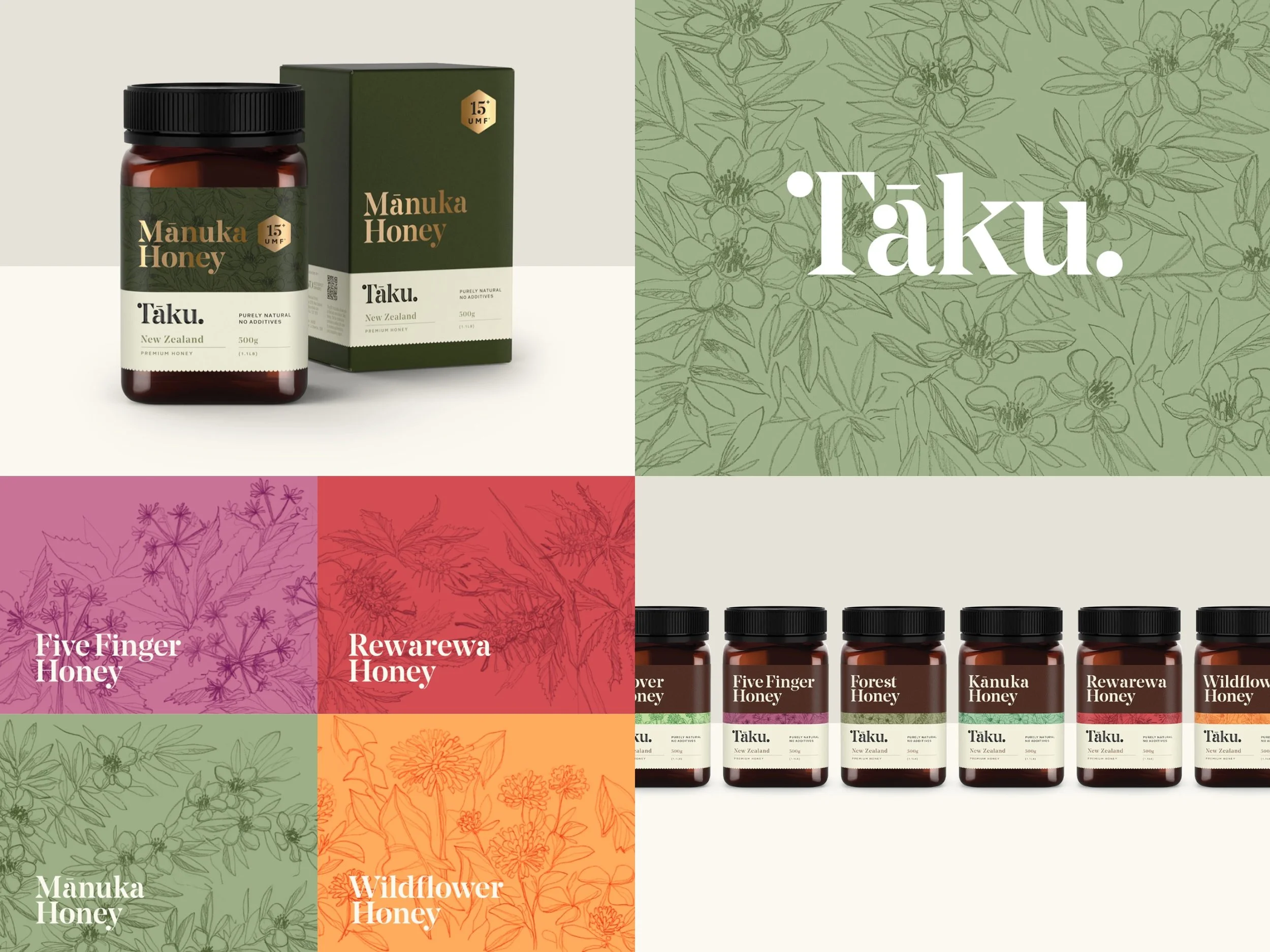
Tāku Honey
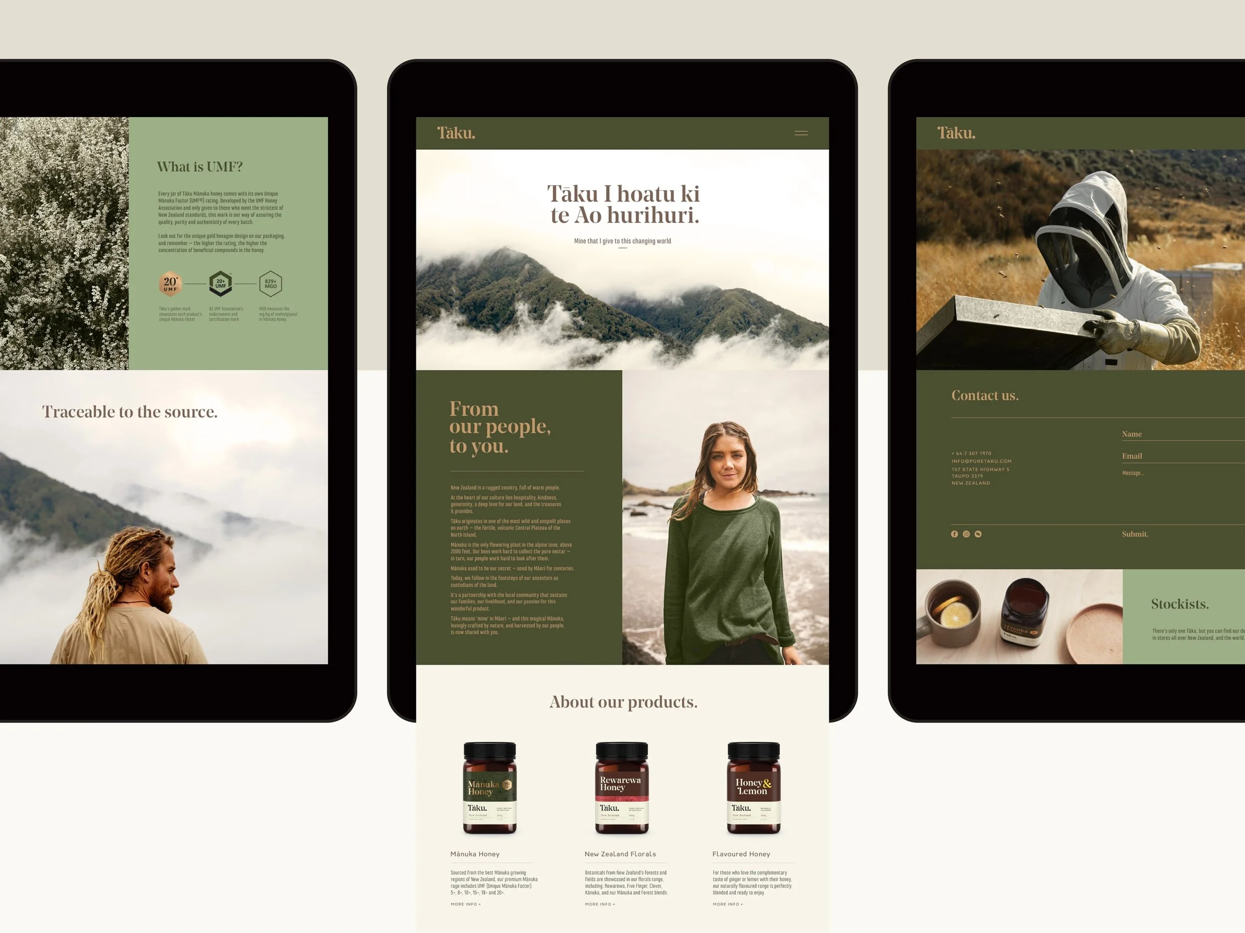
Tāku i hoatu ki te Ao hurihuri.
Mine that I give to this changing world.
Simple words, rich in meaning. A mānuka honey brand developed for the health and wellness sector in Asia and the United States, Tāku needed to carry many layers: cultural pride, natural efficacy, and global relevance.
The honey itself is rare. Harvested above 2,000 feet in New Zealand’s Central Plateau by Westervelt Owhaoko — a partnership between US-based Westervelt Company and local local Māori trust Owhaoko B&D — Tāku Honey is a product of exceptional purity. The brand needed to reflect that rarity and care, while honouring the values of kaitiakitanga and manaakitanga at the heart of the operation.
We led a complete rebrand, from strategy to packaging. Tāku’s identity blends contemporary Māori design cues with soft botanical elements and apothecary-inspired details. The koru in the logotype evokes balance and growth. Hand-drawn botanical illustrations and scalloped edges give apothecary vibes. While the gold foil and embossing express luxury. All designed to resonate in asian gift markets and on California health store shelves alike.
The launch was a success, with strong uptake in New Zealand and Asia, and an effective expansion into the American functional food market. Tāku’s story of place, partnership, and premium quality created a brand with both emotional and commercial value, ultimately helping set the stage for a successful transition to new ownership.
creative direction
CULTURAL COLlAB
workshops + Stakeholder engagement
brand rollout + launch
Brand video
Tradeshow
Design team: Jodine Bell, James Powell, James Stewart
Cultural Advisor: Tom Loughlin
Agency: Principals
Awards
Best Finalist
AGDA Finalist