Kiwibank card suite
As part of a wider brand-led transformation, Kiwibank set out to bring its refreshed identity—rooted in the harakeke metaphor of a thriving, inclusive community—into the hands of every customer. With cards being one of the bank’s most-used touchpoints, they became a key focus for change.
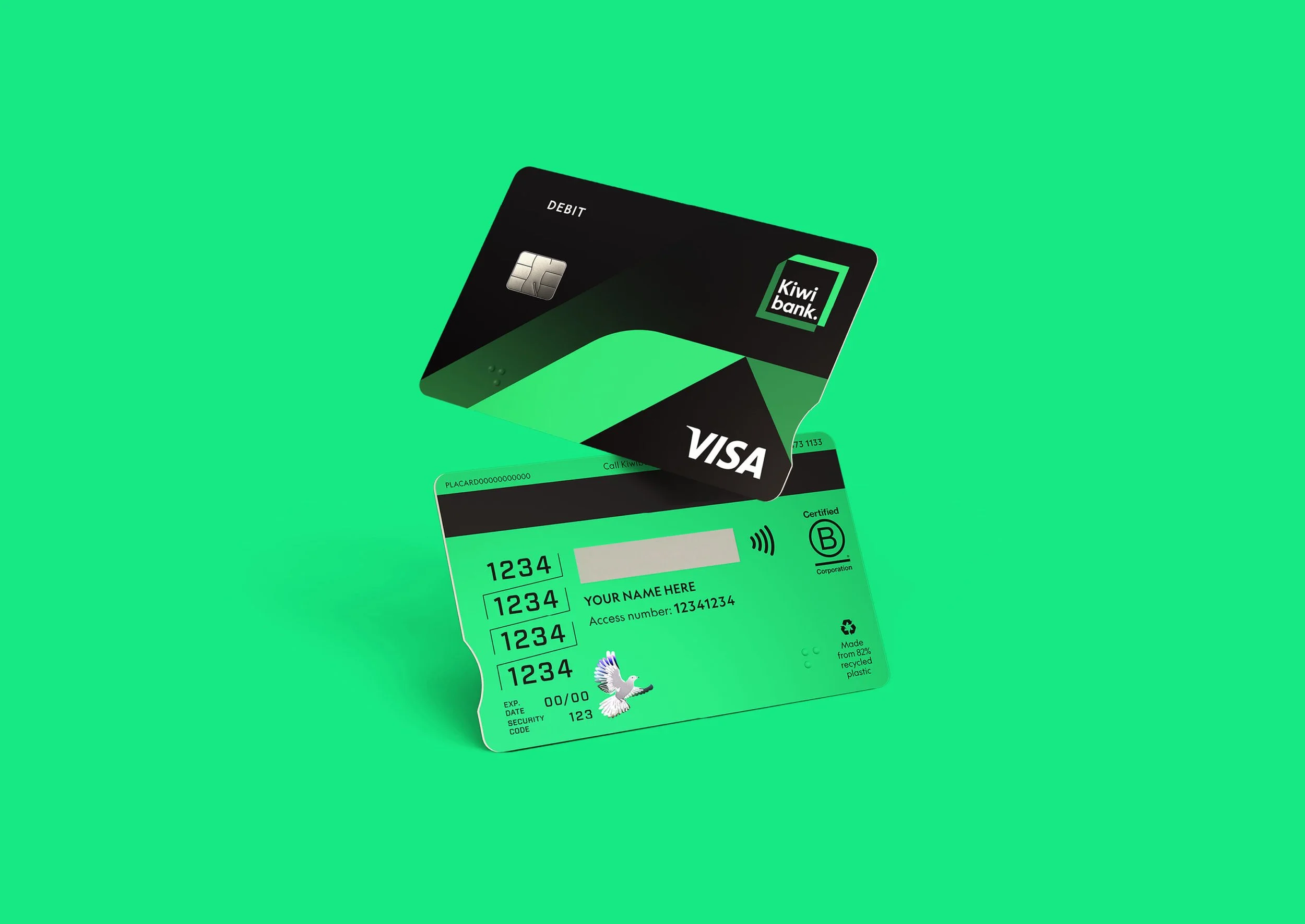
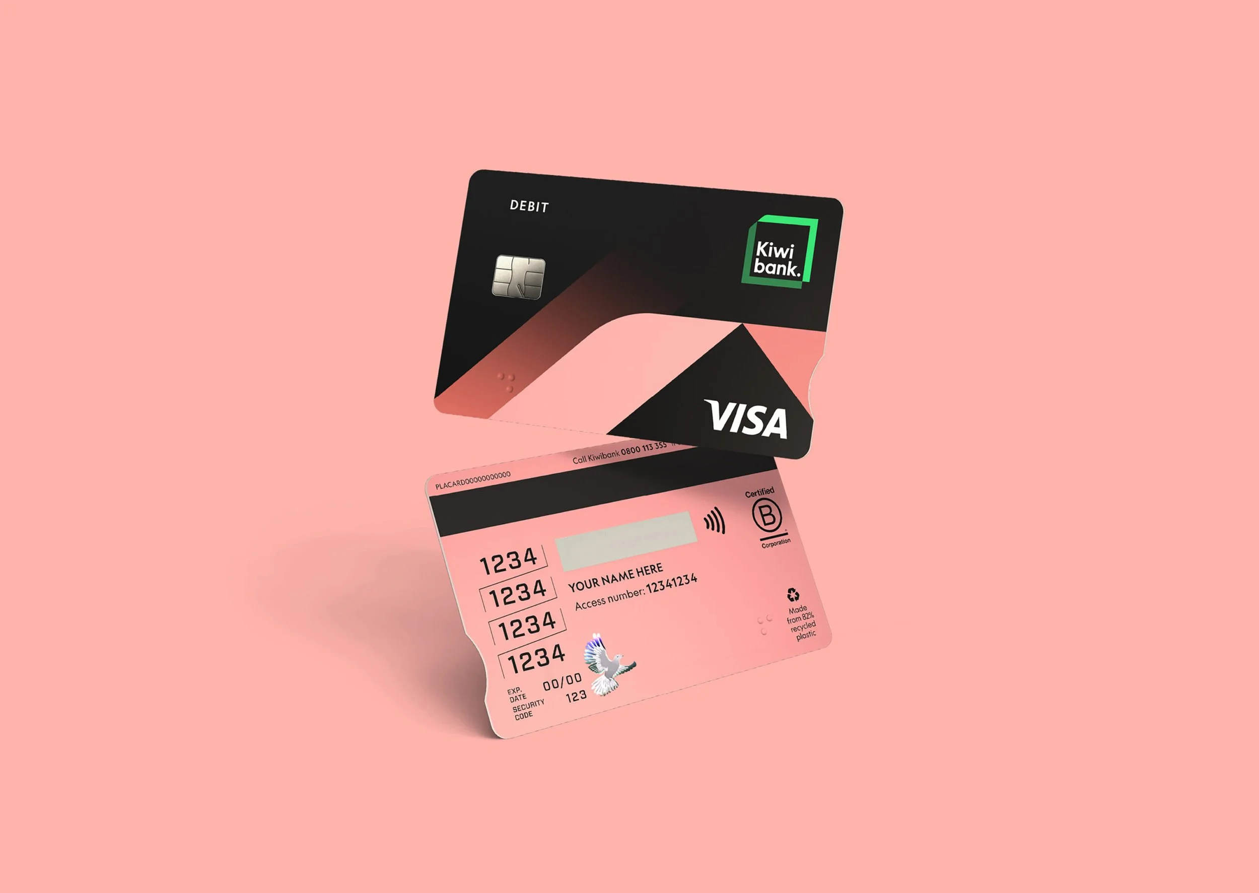
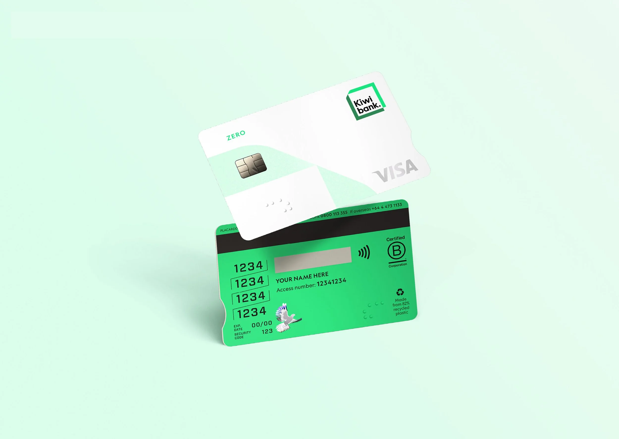
The challenge was to design a suite of cards that reflected Kiwibank’s bold, distinctly New Zealand brand while also delivering on accessibility, sustainability, and inclusion. Each card was designed to feel both part of a cohesive family and tailored to the needs of specific audiences—from retail customers to businesses and younger users. Insights from community consultation directly shaped everything from orientation to colour palette.
In collaboration with the Disabled Persons Assembly and Blind Low Vision NZ, new accessibility features were introduced, including high-contrast designs and easy-to-read numbers. Feedback from Blind Low Vision NZ confirms the redesign will significantly improve usability for blind and low vision customers. Made from 82% recycled plastic, the cards also support Kiwibank’s long-term sustainability goals—ensuring design reflects not just identity, but values.
creative direction
design
artwork
production
Design team: Jodine Bell, Etana Zaguri, Stephen Kane
Agency: Principals
Awards
Best Awards Bronze