Love Taupō
Taupō’s tourism identity needed to do more than name a place. It had to reflect a diverse region, honour its histories, and resonate with locals, domestic travellers and international visitors alike. While Love Taupō had gained strong recognition, it was seen as town-centric, and many communities across the rohe hadn’t been part of the conversation.
A wide-ranging community consultation followed, with open workshops in Taupō, Tūrangi and Mangakino, alongside sessions with iwi and key stakeholder groups. While the name was ultimately retained, the process brought shared understanding and genuine inclusion. Out of it came a new, unifying expression: Heart of living waters – Te Mauri o te Waiora. A simple line that captured something deeper — the life-force that flows through the region’s land, waters and people.
Cultural and strategic advisors from the rohe helped shape the wider story, one that could honour the histories of iwi at either end of the lake, and navigate the ongoing balance of multiple towns’ positions within the region. These perspectives grounded the brand in something real, giving it cultural depth and integrity.
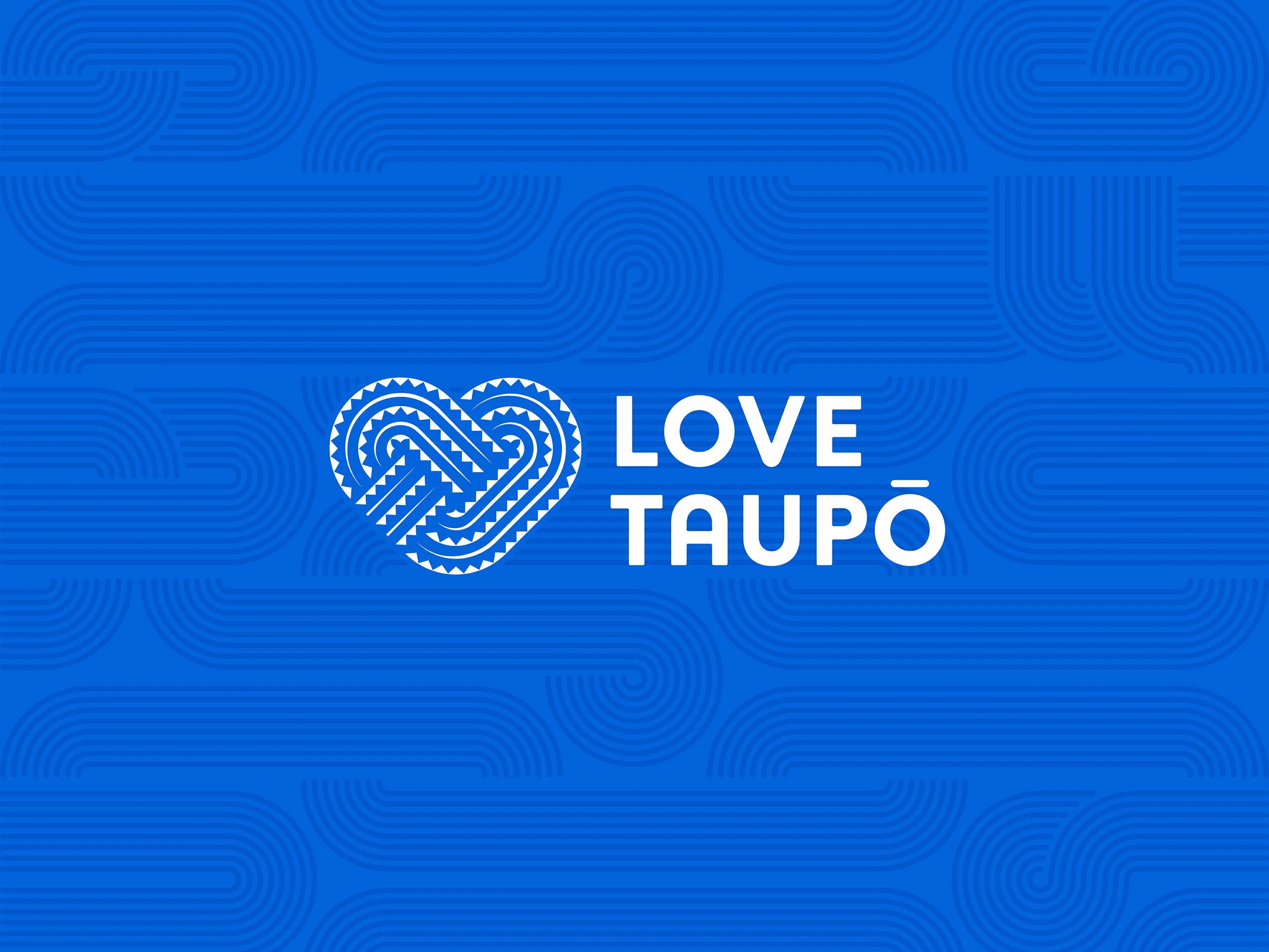
Working closely with a young Ngāti Tūwharetoa designer, the new identity was designed to speak on many levels. For locals, it holds whakapapa and whenua. For visitors, it expresses the energy, movement and richness of Taupō’s waters, volcanic activity and cultural landscape.
Inspired by the journeys of Ngātoroirangi and Tia, the original explorers of the region, and drawing from traditional Tūwharetoa pakati haehae carving, the design brings together story and symbolism. Flowing haehae lines represent the ‘100 rivers’ that shape the rohe. Niho taniwha notching speaks to woven patterns in the cloaks and kete used by Ngātoroirangi and Tia. To express the interconnectedness of life throughout the region, an illustrated Puna Waiora (spring of wellness and life) anchors the system, showing how everything begins and flows from the mountains and rain, down through rivers and lakes, to people and towns.
The result is a regional identity with a clear and layered heartbeat of Māui’s great fish — a brand that connects name, place and people for all communities. An explorer’s heart. The heart of living waters. Te Mauri o te Waiora.
creative direction
community workshops
design
CULTURAL COlLAB
asset delivery
artwork
Design team: Jodine Bell, Stephen Kane
Cultural Design Advisor: Te Manawa Williams
Agency: Principals
This project while delivered, presented and shared with the wider Taupō community, has yet to be implemented, earmarked for later part of 2025.