Palmer
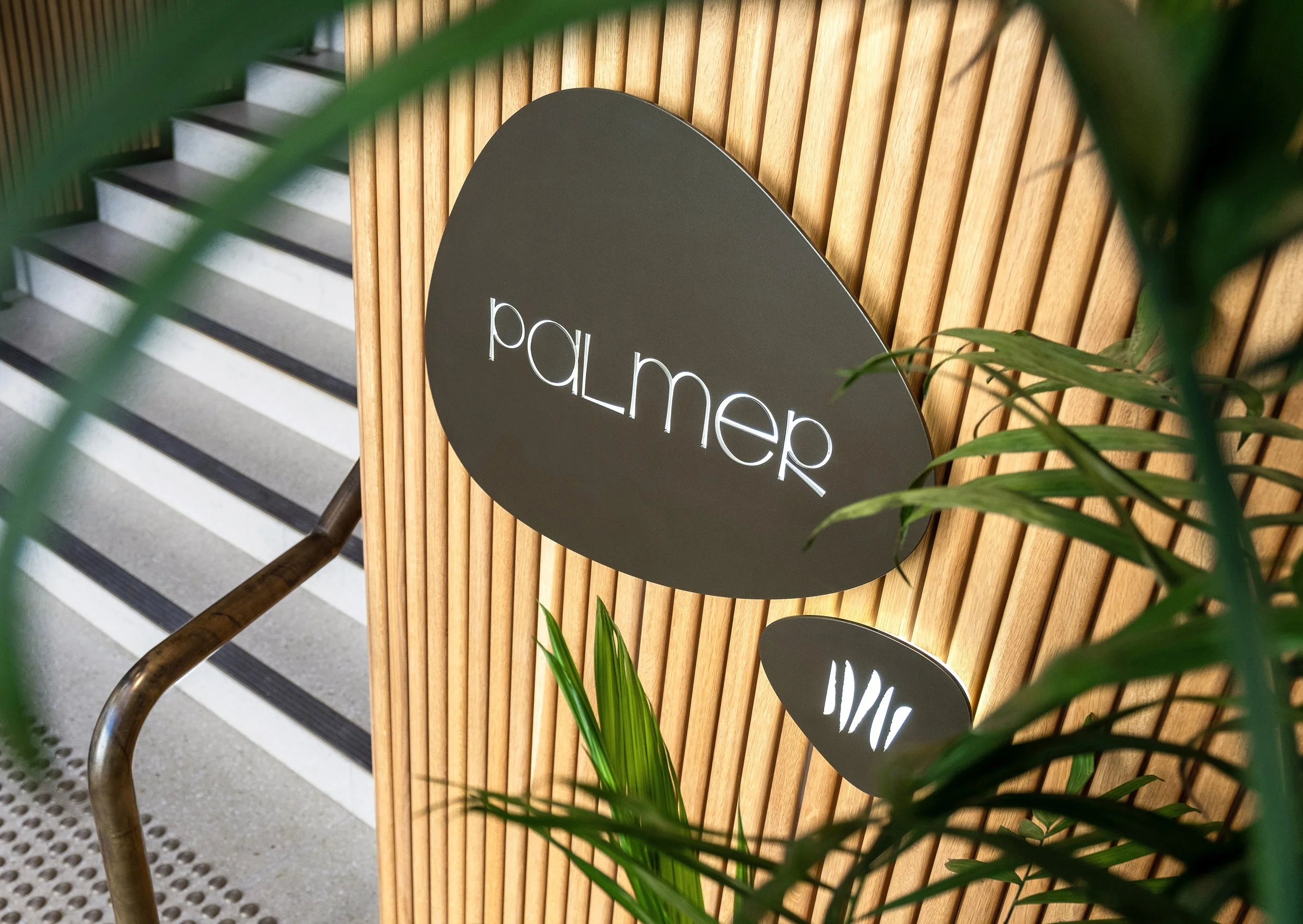
Palmer sits quietly beneath the scooped concrete curves of 1 Albert Street, one of Auckland’s most iconic modernist buildings. From a blank canvas, we were asked to name and brand this new city bar—something welcoming, distinctive, and a little transportive.
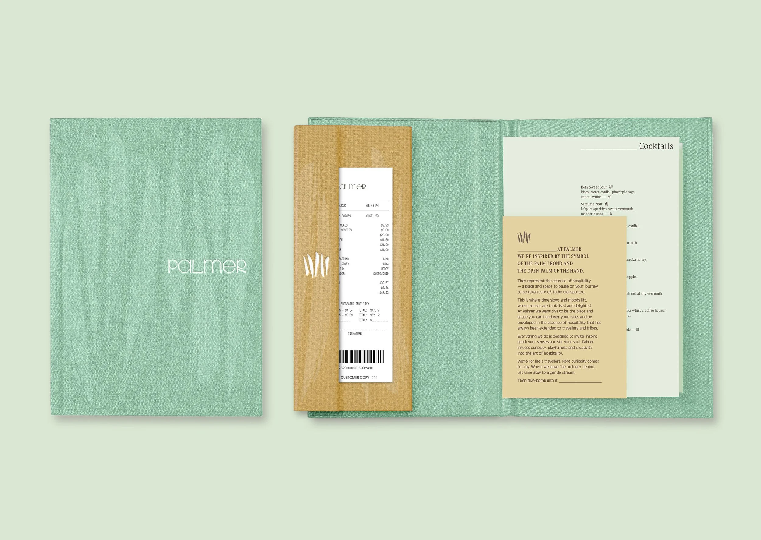
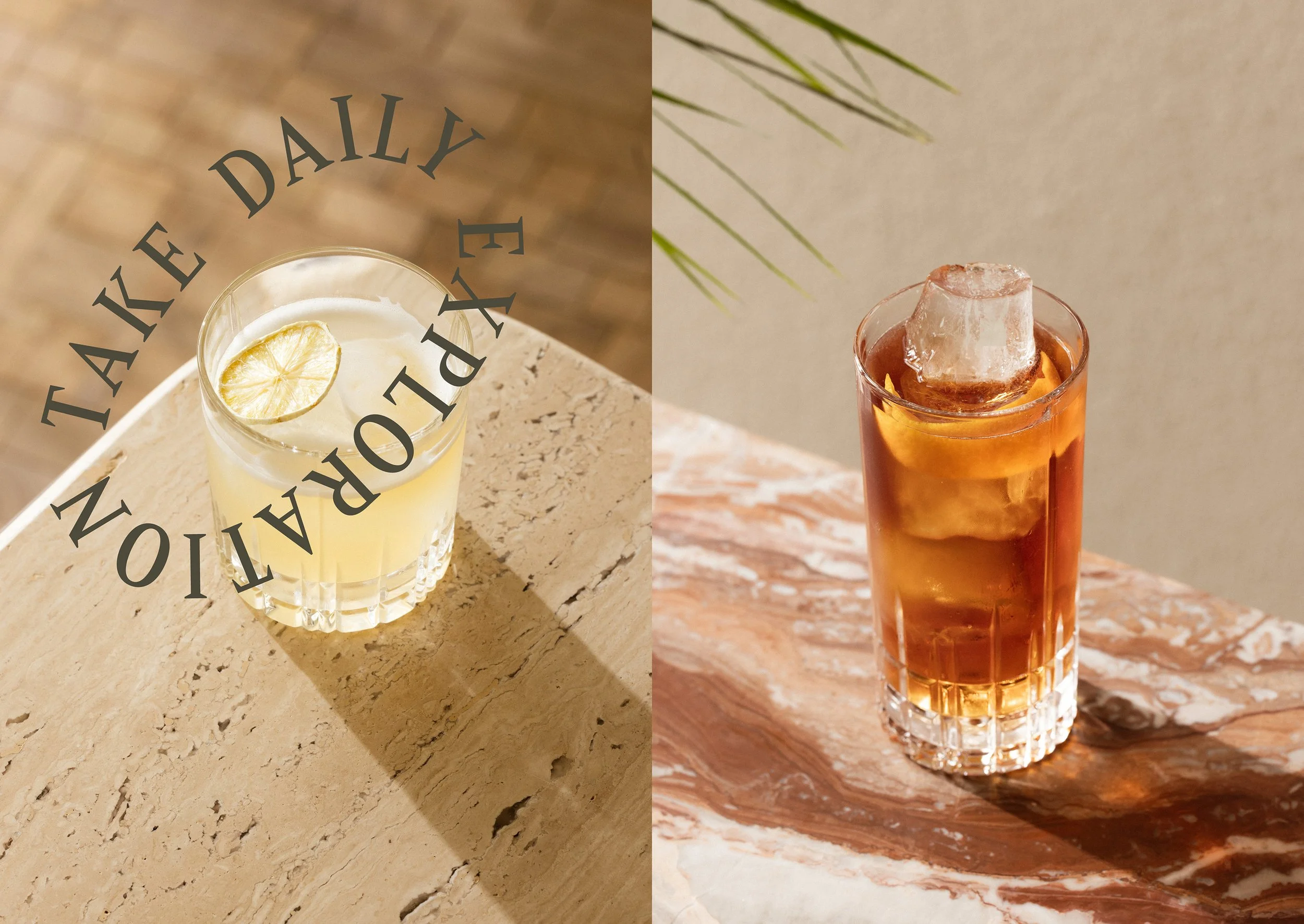
The name and idea behind Palmer were inspired by the palm frond and the open hand. Symbols of hospitality, of arrival, of being taken care of. A place to pause mid-journey, to seek out good company and good drinks, or to simply sit in the shade. The idea shaped everything, from the laidback tone of voice to the five-fingered logo mark and the lush palette that hints at Palm Springs with a distinctly local edge.
Created in close collaboration with architects, interior designers and the wider client team, Palmer became more than a bar. It’s a pocket of calm in the middle of the city, and exactly the kind of place you want to spend an afternoon that turns into evening.
creative direction
STRATEGIC THEMING
brand rollout
styling direction
signage
production
Design team: Jodine Bell, Stephen Kane
Strategy/Naming/Writing: Teresa Harris
Agency: Principals